Inktree Translations
A portfolio website for a specialist translator working across psychology, healthcare and editorial.
Project
Inktree is a website for Cansu Uçar, a specialist translator with sixteen years of experience across psychology, healthcare and editorial work. Her clients range from Tumblr to Doctors Without Borders to publishers across Europe. The brief wasn't really about pages and features. It was about feel. Cansu needed a website that communicated expert-level credibility while still feeling personal and hand-crafted. Professional enough to win serious clients, distinctive enough to feel unmistakably like her.
A hand-drawn world
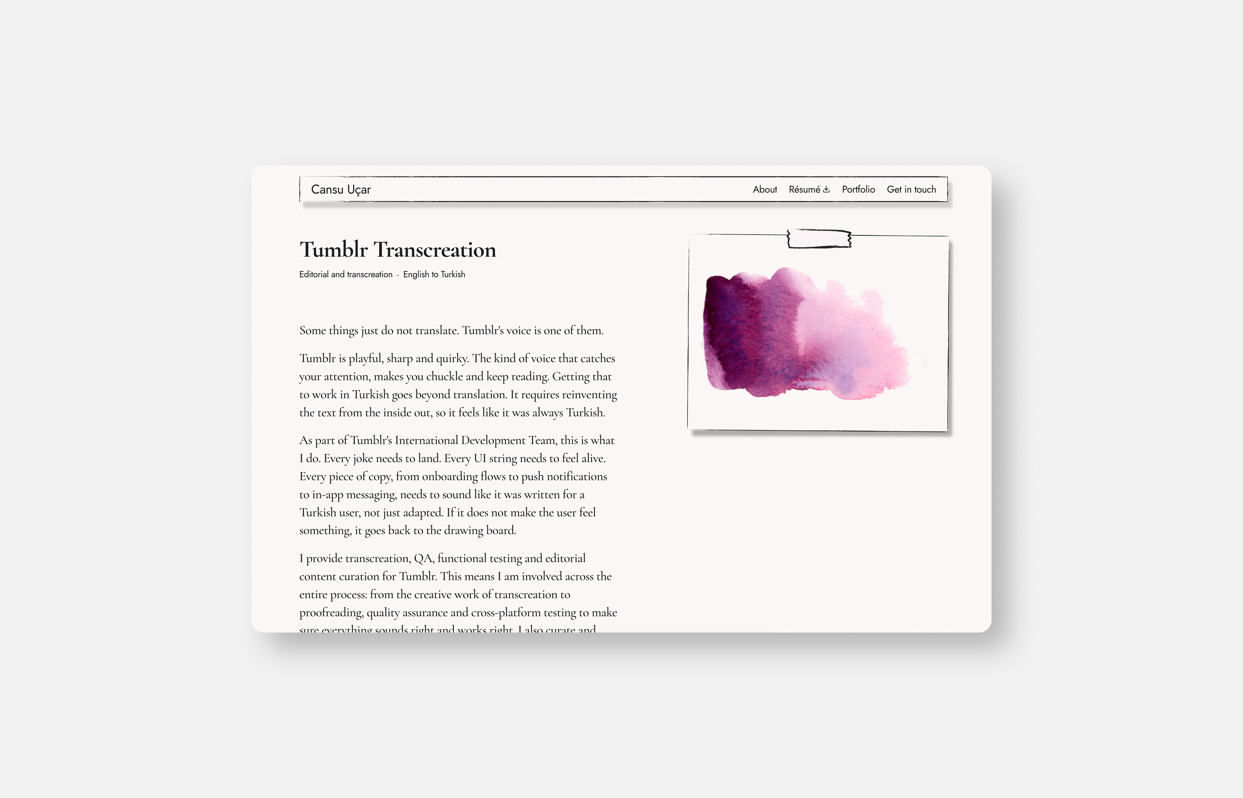
Cansu is also an illustrator. Rather than sourcing stock assets, we built the entire site around her own hand-drawn work. The bird that welcomes visitors on the homepage, the colour swatches that distinguish each portfolio case study, the small details throughout, all of it is hers. This is what gives the site its identity. It could not belong to anyone else, because the illustrations came from the person the site is about.
Built on paper
The central inspiration was paper. Every container and box on the site was built with brush vectors rather than clean geometric shapes, giving the whole page a hand-drawn, textured quality. The goal was a site that felt like it belonged in a library, with the same precision and depth as Cansu's translation work.
Typography with character
The type pairing balances two sides of Cansu's work. Cormorant Garamond for display sizes brings an editorial, literary quality that suits a translator working across books and psychology. Jost handles the body text, keeping everything clean and readable so the personality never gets in the way of clarity.
The portfolio
With sixteen years of work across mental health, clinical research, NGOs and editorial translation, the challenge was presenting depth without overwhelming visitors. Each case study is colour-coded with one of Cansu's illustrated swatches, turning a long body of specialist work into something navigable and visual rather than a dense list of credentials.
Results
The site launched live at inktree.nl, giving Cansu a professional home for her work that stands apart from the generic directories and template portfolios common in her field.
Type
Role
Role
Year
Link


Typography with character
The type pairing balances two sides of Cansu's work. Cormorant Garamond for display sizes brings an editorial, literary quality that suits a translator working across books and psychology. Jost handles the body text, keeping everything clean and readable so the personality never gets in the way of clarity.
The portfolio
With sixteen years of work across mental health, clinical research, NGOs and editorial translation, the challenge was presenting depth without overwhelming visitors. Each case study is colour-coded with one of Cansu's illustrated swatches, turning a long body of specialist work into something navigable and visual rather than a dense list of credentials.


Results
The site launched live at inktree.nl, giving Cansu a professional home for her work that stands apart from the generic directories and template portfolios common in her field.
A hand-drawn world
Cansu is also an illustrator. Rather than sourcing stock assets, we built the entire site around her own hand-drawn work. The bird that welcomes visitors on the homepage, the colour swatches that distinguish each portfolio case study, the small details throughout, all of it is hers.
This is what gives the site its identity. It could not belong to anyone else, because the illustrations came from the person the site is about.
Built on paper
The central inspiration was paper. Every container and box on the site was built with brush vectors rather than clean geometric shapes, giving the whole page a hand-drawn, textured quality. The goal was a site that felt like it belonged in a library, with the same precision and depth as Cansu's translation work.
Type
Role
Year
Link
Project
Inktree is a website for Cansu Uçar, a specialist translator with sixteen years of experience across psychology, healthcare and editorial work. Her clients range from Tumblr to Doctors Without Borders to publishers across Europe.
The brief wasn't really about pages and features. It was about feel. Cansu needed a website that communicated expert-level credibility while still feeling personal and hand-crafted. Professional enough to win serious clients, distinctive enough to feel unmistakably like her.